Thursday, 28 March 2013

Final Piece.


Project Proposal:
"I will explore vulnerability through the use of painting techniques. I want the viewer to feel uncomfortable, so I will be exploring large scale portraiture, and through experimentation I will decide on a painting technique, medium, material and tools to use for my final piece. I shall make samples using different media, a range of surfaces and tools, documenting the exploration and my ideas digitally on Blogspot."
______________________________________________________________________


As a result of my research into artists, painting techniques, and my own investigation through experimenting with media, materials and techniques, this is my final piece...


I chose scrap cardboard as a surface for my final piece as it is classed as a 'poor material' because it is cheap and highly manufactured which links to my theme of 'vulnerability'. This particular cardboard has creases and jagged edges, making the material itself look vulnerable, it isn't as strong as wood but it isn't as weak as paper but it is extremely absorbent so I did find myself working at a fast pace and applying the paint really thickly, which shows in the painting itself with the directional marks I made with my fingers. These marks are really gestural and create form by showing the rounded cheeks and forehead  as well as the shape of the nose. I chose emulsion paint for the painting because it is cheap and everyone uses it. In fact this piece cost me nothing but time, as they were all found materials, so the cardboard and the paint had already been used which links to vulnerability as I have used abandoned, worthless materials, to create a fine art painting of my sister as a baby. The subject itself is vulnerable; a child. The expression on her face is innocent, and the way she is looking up suggests she is weak and almost afraid, and the quick layered paint technique of contrasting cold and warm colours stir a vulnerable atmosphere where the subject seems scared, not just because of the expression, but the use of the unrealistic and unblended scratchy streaks of colour create an abusive brutal painting. The colours I have used build up tonal value to the painting, the purples are darker and the blues and whites are lighter, combined with my gestural mark making the painting looks 3 dimensional, instead of flat, I gave it depth which somewhat brings it to life. I used the under painting and overlaying painting techniques to build up this painting with layers of paint to create this colourful fast expressive piece using only my fingers and hands to apply and control the emulsion paint, which I really enjoyed because I could get close with the paint which felt quite intimate, because this image is personal to me and the use of my body painting a portrait of my sister worked really well, I really think it is an appropriate way of painting this piece.
I really think this project went well, considering I was working completely out of my comfort zone by working large scale for the first time. I had to move around the painting to work on each section which is something I have never needed to do before with the small scale pieces I have produced in the past. This was an active piece of art work and I really enjoyed making it, and stepping out of my comfort zone which I think is very important in the art industry; trying out new things to push your artwork further because you just don't know what will happen until you try. I surprised my self actually. I must admit I was quite worried to work big scale in case it all went horribly wrong, it isn't something you can hide if you make a mistake whereas working small at a desk is easy, because no one is there watching over you, so I did in fact gain confidence with this project, as I had to work in the hallway at college as there was no room in the classroom, so people were walking past watching me paint, which is something that I have never liked, but I did get a lot of compliments.

I had a few ideas on how to present my final piece, I thought if it was left off the wall it would keep to an abandoned theme, as on the wall it would look out of context. It wouldn't look vulnerable it would look valuable, and that would not work well with the theme, so I had a play around with found boxes to make some kind of rubbish tip installation, making the painting look abandoned, I added a rubbish bag and decided to include the tubs of paint I used, arranging them and spilling their contents down boxes in the installation. I took photos of this as I wasn't able to keep this in the corridor as it would have been in the way, however,I plan to reduce the installation and keep it out the way in the corner of the corridor, because I really think the arrangement of neglected worthless objects reinforce and create a vulnerable atmosphere for my painting. I considered cutting the cardboard down to shape and using the edges to reinforce the back of the painting to keep it sturdy and flat, but as I played around with the arrangement, I decided I really liked the creases in the cardboard and how I could bend it at angles to create something more sculptural than just a 2 dimensional painting on the wall. I am really pleased with the way I presented my final piece, it was fun and I have never created an installation piece before and would love to do it again.
The only factor that I didn't like is the quick drying time of the emulsion paint which forced me to work fast and literally slap the paint onto the cardboard so it was thick, as I needed to work the colours into each other before they dried to build up tone with the contrasting colours with my fingers, but then I did actually get a positive thing out of this. The layered paint created a textured painting and the marks I made with my fingers look obviously fast which gave the painting it's layered brutal appearance, as if the contrasting and unrealistic colours cut you up with its edgy atmosphere, accentuating vulnerability. So even though the experience of creating my final piece was rather difficult, I am really pleased with the outcome and I believe I have successfully worked closely to my project proposal and created an outcome that exactly explores vulnerability. Personally, the layered jagged textured  paint combined with the afraid look in the child's eyes does create a vulnerable atmosphere, but whether you  feel uncomfortable or not, you decide.

Monday, 25 March 2013

Experementing with paint.

This sample is acrylic on paper, applied with a paintbrush. The paper is not a sturdy material to use as the weight of the impasto acrylic causes the paper to flop. Acrylic paint is really thick and dries really thick, it maintains its application of marks and directional brush strokes. The paint does not sink into a flat form, it dries exactly the way it is applied and I really like this gestural and expressive appearance acrylic paint has. This paint combined with the impasto technique wipes out realistic features and welcomes expressive textures, brush strokes and even colour as I have demonstrated  I love the colours mixing together, strokes of yellow green and brown harmoniously dragged around the painting together. There is a choice here of building up realistic tonal value to create a form, or abstract colours can be used in the form of expression.


I decided to do another impasto portrait using acrylic paint, but this time on wood. I under painted the piece with yellow ochre so the painting would keep the yellowy colour from the lighting in the picture I painted from. I used a palette knife to apply the paint  and in other areas I used a paintbrush. The wood I nailed to an easel to keep it still whilst I painted on it. I really like the wood as a surface to paint on as it is really sturdy and absorbent so thick impasto paintings in acrylic dry reasonably faster than on non absorbent materials like perspex and metal. Drying time was roughly 5 hours. Here, unlike the painting before, I blended earthy realistic colours to create gradual tonal value and the harsh shadows and highlights to define the eyes and the shadows on the child's face. The texture from the palette knife makes the painting appear and feel really harsh as the texture is heavily scratchy, almost like the child is cut up or carved, the sgraffito technique also works really well in combination with impasto as the two techniques contrast heavily with the thick paint enhancing the depth of the marks made from the sgraffito technique created with the end of the paintbrush which is perfect as it is blunt but strong to create sgraffito marks.


I experimented with paint to create a cheap substitute to acrylic. I applied the paint with my fingers which looks really fast and gestural. On a perspex surface I mixed emulsion paint with PVA glue to thicken it up and make it shiny. Of course this wasn't enough to thicken it up but it did dry really shiny and smooth. I mixed sand with the emulsion paint to give it texture and thickness. Emulsion paint is the green  paint seen in the picture, the blue is acrylic, I wanted to add sand to that to compare the end result with both paints. The result was that the sand mixed with acrylic was the same as sand with emulsion, however I mixed glue with the emulsion paint so the emulsion and sand dried shinier and slightly smoother than the acrylic and sand, I had to work with the perspex laid on the floor as the sand wouldn't stick to the perspex, it just kept falling off.


I then decided to mix something finer like really fine sawdust that I collected from the 3D room in college, the dust from silver birch wood. Its absorbing properties made the emulsion paint dry faster. I mixed the two together then poured and spread the mixture out on cardboard. The texture was made by a palette knife and to my surprise, the emulsion paint didn't flatten out it actually kept its texture from application. the cardboard was strong enough to stay put, but the mixture was applied really thickly and as a result was really heavy and dried like concrete giving the cardboard a really strong support.  but a bigger piece of card board would have to be laid on the floor until dry or perhaps hammered to the wall because it wouldn't be able to take the weight until dry. the texture when dried is really rough and ragged, actually as rough as the sand. It dried almost in the form of a rock! However I really don't like the thickness and the rough texture. It isn't like acrylic paint, it isn't as smooth or manipulative. I have no control over this emulsion paint mixed with sand or the emulsion paint/acrylic paint mixed with fine sawdust.
I did actually try and use the mixture of sawdust shavings and emulsion paint to paint a portrait on cardboard. However the shavings were harder to control, I was literally dragging and plonking bits of painted sawdust to create the painting. I prefer the finer sawdust as it actually works in the form of a paint mixture, thick and textured, but the sawdust shavings were extremely annoying and the dried painting had no desired texture at all. Lumpy and annoying, and I had no control over it. The colours I used however I quite like, you can see the beginning of the build up of tones of blues to create shadows and highlights. I used my fingers yet again to apply the paint as I can become closely involved in the painting, I really prefer using my fingers to paint with. This has also put an idea in my head, that it seems relevant to paint a person, someone's flesh and features with my own body. So I really feel that painting with my hands is interesting combined with the subject I have chosen to paint- portrait. However because fingers allow for not much detail, I will have to experiment on larger materials or  concentrate on one section of the face for a sample maybe...

I went back to using sand and emulsion paint to paint a portrait. Again I applied the paint with my fingers, smearing and starting to create tonal value with the colours. Because I really like the blue tones I decided to stick with this colour to use for the majority of the portrait. Adding black, purples, reds and greys I tried to show directional marks to create form alongside tonal value. I do really like the colours used and the face they are unrealistic. They are surreal, and they are really gestural and expressive. The texture of the dried painting is rough because of the sand, but I used less sand on this piece and I really like it not being as thick as previous paintings because it still has texture with the sand and I find it really easy to control but really interesting and equally as challenging as I have never tried this style before, so it was difficult to show tone and form through unrealistic colours. Also the red really contrasts with the cool blues and greens, which vibrates and moves against the rest of the portrait.


I began this painting using ink with a bamboo stick to draw the life model, making scratchy marks to suggest tone and shadow. Then I watered down blue acrylic paint and washed the entire page with the blue diluted acrylic paint. The blue became a theme of mine, maybe because of its stereotypical mood of sadness, but I really love the coolness of blue and the heat and strength of the red, both colours extremely contrasting, almost at war with each others differences. I began using the red as a shadow and the blue became the lighter areas, creating tone through the two primary colours. I used a piece of card to apply undiluted acrylic paint, smearing it on in the darker areas, but not too much. I diluted the red acrylic to use as faint washes of red to create tone. Then I worked back into the ink using a bamboo stick. The stick was tricky to use, but it stopped me from being too precise and being able to dilute the ink for blending, the bamboo stick added interesting scratchy marks to the painting that I really personally like. I had concentrated on shading for long enough after this point so I introduced white acrylic paint to my piece, smearing on highlights with a thick piece of card. This sample is interesting as there are drips of ink, drips of blue and red diluted acrylic paint and a contrast of thickly applied acrylic paint adding texture and harsh colour to the piece, and the soft diluted colours creating drips but no texture. This combination is really interesting and I have managed to create a really nice painting, investigating the dilution of acrylic paint and the thickness and texture of acrylic  Also I have combined impasto with watercolour and the 'drippy' technique of ink and watercolour.

I decided to just try emulsion paint on its own as I hadn't done already, again applying the paint with my fingers, I tried to build up tone using the colours, which I find really tricky. Building tone with unblended colour is something I am going to work on for my next emulsion painting. I painted on metal for this piece, and I really love how the paint glides smoothly against the metal. I have managed to create the form of the portrait using directional marks which forms the rounded shape of the cheeks, the eyes and the nose. I love the use of unblended colours, it really gives the portrait an edgy harsh appearance which is exactly what I want to achieve. I would like to use this style for my final painting.


I decided to try one last material, wood board as it is like cardboard and wood. I found the material too absorbent and I would have to apply the paint really thickly to move it around with my fingers. You can see evidently that I struggled to move the paint around the wood board with my fingers, I just couldn't work the colours into each other and create the tone as well as on the previous materials. Because I was going to be working bigger scale than this sample I would not get along with using this material to paint on with emulsion paint and as a result my final piece would suffer. I want to use cardboard as my final piece because metal and perspex is too smooth to work on and the paper is not sturdy enough to hold thick paint but cardboard is strong and not too absorbent. I experimented with colour here, moving away from blues and greens to something brighter like pink/purple and yellow. The colours are too bright, I really don't like the look of it and the proportion is not right because I am not used to working on a bigger scale. I will have to project the image of my sister onto my final piece before I start painting so I can draw the image perfectly onto the large cardboard to get the proportion right. II like how the yellow and purple vibrate against each other because the contrast so heavily  but the colours used ere are too happy and bright, I want to keep the colours cold and negative, exactly like the painting onto the metal. I love the cold and warm colours together. I don't like how the eyes are realistic colours and the face isn't, so I will paint the eyes the same purple I will use in the painting to create tone. But I love using my fingers as a tool to paint with, creating gestuaral marks which shape the facial features and create form.

Thursday, 14 March 2013

Painting Techniques

IMPASTO:
The process or technique of laying on paint or pigment thickly so that it stands out from a surface.

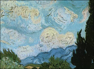
Impasto is an application of paint (oil, acrylic, varnish) which is applied thickly, and dries as a heavily textured surface, it really makes a physical statement, which is why you’ll find it most often in expressive, abstract works, such as Jackson Pollock, Vincent Van Gogh and Williem De Kooning. Impasto has been around for a very long time, but it was Van Gogh that started using it for its expressive qualities, using impasto to give weight to his brilliant colors, movement to his skies, and emotion to his landscapes. This painting technique is almost three-dimensional in appearance. Using an impasto technique often leaves visible brush strokes in the finished painting. Many times those brush strokes are actually more important than the subject matter itself. Impasto is a type of sculpture, but for painters.
Detail of Wheat Field with Cypresses by Van Gogh

Impasto paint serves several purposes. First, it makes the light reflect in a particular way, giving the artist additional control over the play of light on the painting. Second, it can add expressiveness to the painting, the viewer being able to notice the strength and speed applied by the artist. Third, impasto can push a painting into a three dimensional sculptural rendering.

a major figure in the abstract expressionist movement. Jackson Pollock was well known for his uniquely defined style of 'drip painting. Pollock worked on large scale pieces, using colour to express his intense emotions, using sticks, trowels, knives to aggressively spill and splatter the paint, producing heavy impasto with sand, broken glass or other foreign matter added to the paint. As a result, his finished dry paintings have a heavily textured surface, this combined with the abstract expressionist 'drip' paint, expresses the difficult life Pollock lived in, showing his most inner turmoil and unhappiness. The German born figurative painter Frank Auerbach used thick colourful oil paint which he applied with pallet knives or thick paint brushes, distorting the subject almost completely. In spite of the excessive piling on of paint, the effect of these works on the mind is of images recovered and re conceived in the barest and most particular light. He paints the world in chaos.

Frank Auerbach

. 
                       Jackson Pollock.


SCUMBLING:
Modify a painting by applying a very thin coat of opaque paint to give a softer or duller effect.

Scumbling techniques have been used by master painters since the 1600s to create smooth gradations, modify a previously dried layer of paint and to add a sense of depth. This technique is accomplished by applying thin layers of light opaque colours over dark layers of dried transparent paint. The final results gives a painting a surface that various in how much of the under painting is revealed. The ultra thin layer of an opaque paint can soften an area of a painting while giving it a misty, almost out of focus look that might be typical of background objects. Adding a thicker layer of paint to an area would naturally give that object an appearance of being in the foreground. However, scumbling too much of a canvas with thick opaque paint can result in a return to a flattened sense of depth. The scumbling technique is often used to create a beam of light penetrating an otherwise darken room. It is also useful to add a glowing effect to accentuate individual objects and skin tones. Scumbling may be achieved by scraping, scrubbing or dragging the lighter layer of opaque paint over a dark underpainting, resulting in a hazy, opalescent effect. Scumbling allows the artist to effect smooth transitions from light to dark and to modify the original colour of the overlaid area without completely concealing it.


UNDERPAINTING:
Paint subsequently overlaid with another layer or with a finishing coat.

Andrea del Sarto
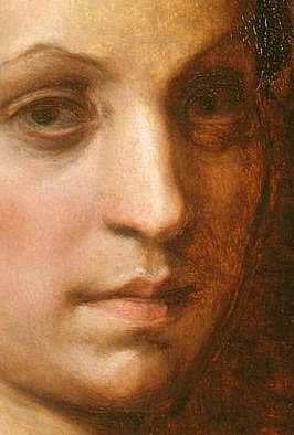
One of the most widely employed Old Masters painting techniques , underpainting is the preliminary process that allows the artist to render the outline, define the composition, and set the tonal atmosphere of his or her painting. Underpainting creates a neutrally coloured version of the final painting using tempera or oils. Tempera is a medium of painting in which pigments are mixed with an emulsion of egg yolk and water. Successive layers of colour are added over the underpainting to produce the final work. Otherwise known as dead colouring  underpainting is usually monochromatic but may also be coloured. Underpainting guides the artist through the arduous and painstaking endeavour of creating a masterpiece by establishing a tonal and compositional path for the artist to follow. Vermeer used the underpainting technique with oil paint, the technique which defined one of the most important stages in his working procedure. The Italian Renaissance painter Andrea del Sarto used a white undertone for highlighted areas and darker colours for shadows, an example of his underpainting technique is 'Portrait of a Woman In Yellow' (picture to the right) which has a sketchy, warm brown underpainting, seen in the right-hand side of the face of an unfinished portrait.


SGRAFFITO:
A form of decoration made by scratching a surface to a lower layer of a contrasting colour.

 and sgraffiti come from the Italian word 'graffiare'' which means 'to scratch' which was a technique that played a significant role during the years of the Renaissance in Italy. It is a painting technique where the artist scratches into the top layer of the paint to reveal areas of the surface underneath. This method is best suited for oil paint as the paint stay wet longer, but acrylic paint can also be used if you work fast. The images are built up by applying thick layers of paint, and then by using a blunt tool, you scratch into the top layer to reveal the white background surface or another colour underneath. The background can be painted simply white or monotone colour, or a variation of colours and patterns can be created as a painting surface. For a more complex pattern, a third layer of paint in a different colour can be applied on top and then scratched into again to reveal both layers underneath.You can use a combination of brushes, painting knifes, needles and brush handles to create the different marks and textures depending on the effects and lines and patterns you require. The tool you use should not be too sharp so you avoid cutting through the paper or scratch the underlying paint or surface. Sgraffito is especially effective on impasto painting.


GLAZING:


Glazing is a technique employed by painters since the invention of oil painting.Paint glaze is a thin, translucent film of color painted over a base coat of paint. The purpose of painting this way creates a special optical effect, resulting in a deeper and richer color than if you had mixed the two colors on a palette and then applied it to the canvas.Glazing tends to settle in the crevices of the canvas texture and the top can be wiped off to show the original color, but the glaze down in the texture will alter the color tone of the underlying hue.Paint glaze is commonly used in many faux and decorative painting techniques and plays an essential part in creating a rich, dimensional look for paintings, and increasing the paint’s drying time, giving it appearance of depth and dimension, and perfecting the color. Make sure to work in a well-ventilated area, as the odor from the paint can saturate your working or living area. You can glaze with any pigment. Some pigments will fade much more than others over time; and how you layer scumbling and glazing affects the basic physical structure of the painting. improper application can result in cracking or flaking.
The dark transparent pigments are sort of slimy or jelly-like and behave like wood stain.
The dark staining pigments have smaller, rounder molecules which penetrate surfaces more, and don't reflect as much light. The bright reflective pigments are stiff and clay-like and behave more like chalk
The clay-like pigments have large rough molecules with many reflective surfaces.
Vermeer built up his paintings in a series of successive glazes is incorrect and creates a distorted perception of Vermeer's painting methods. An oil painting cannot be created by a series of successive glazes as if they were water color washes. The bulk of painting in the 17th century was executed with opaque and semi-opaque layers of pigment. Glazes also attract dust due to their high oil content. Dutch painters like Vermeer, used glazing very selectively according to well-known formulas.
A superb example of glazing can be found in Vermeer's Girl With A Red Hat (see image left) various stages of the seventeenth-century multi-stage painting process can be observed. The red hat, according to common practice for painting bright red objects, is first modeled with shades of pure Vermillion  and black. Subsequently, once the underpainting is thoroughly dry, the lighter areas will be glazed with a thin layer of pure madder lake while the shadowed areas would be deepened with a thicker glaze of madder lake and, perhaps, some black. 


STIPPLING:


Applied with a pen or brush, dots compose a painting or drawing to create tone.The art of stippling is building colors in a subtle way using a sponge or a stiff bristle brush. Nearly any type of firm brush can be used for this type of painting. The technique allows the painter to achieve beautiful gradations of color with variations in the intensity of the colors applied. Foliage or backgrounds are great for surfaces using this technique. Use dark, medium and light colors when stippling to create depth.
Using the right tools for the job is important. Soft brushes don't work, but a stiff brush or even an old one with splayed bristles will do nicely. Sea sponges also work very well to achieve gaps and spaces that will allow you to return to those open areas once the foundation color has dried. You can then apply more color or different values of color. Paint trays or plates allow space for blending paint. Clean the brush or sponge often in order to keep the colors from becoming tainted by one another. Colors should be well separated on the tray so you can pick up just what you need as you work. You can stipple oil paint over an acrylic base coat, but acrylic paint won't adhere properly and stay fast to an oil painted surface. Paper towels or old rags come in handy for cleanup.

WET ON WET/ALLA PRIMA:

File:Winslow Homer Rowing Home.jpg
is a painting technique, used mostly in oil painting, in which layers of wet paint are applied to previous layers of wet paint. This technique requires a fast way of working, because the work has to be finished before the first layers have dried. It may also be referred to as 'direct painting' or the French term au premier coup (at first stroke).Wet-on-wet painting has been practiced alongside other techniques since the invention of oil painting, and was used by several of the best Early Netherlandish painters in parts of their pictures, such as Jan van Eyck in theArnolfini portrait, and Rogier van der Weyden. In traditional painting methods new layers were applied to most parts of a painting only after allowing the previous layer to completely dry. This drying process could vary from several days to several weeks, depending on the thickness of the layer. Work done using "alla prima" can be carried out in one or more sessions depending of the type of paints used and their respective drying time, but it is mostly done in one session or "sitting" only. In the medium of watercolours, wet-on-wet painting requires a certain finesse in embracing unpredictability. Highly translucent and prone to accidents, watercolor paint will bloom in unpredictable ways that, depending on the artist's frame of mind, can be a burden. watercolour bleeds into the wet surface such as in Winslow Homer's (1980) 'Rowing Home' painting above.


Monday, 4 March 2013

Evaluation for Portrait Paint


Gillian Lee Smith's mixed media


The artists I have selected for inspiration for my final piece are agnes-cecile, Gillian Lee Smith and Pilippe Pasqua. These three artist have a few things in common with each other, which I will use to motivation my final painting. Pasqua and agnes-cecile both work on huge scale paintings, and they base their portraits on emotion, using alot of colour, and combined with their discinctive painting techniques, they create an atmosphere that makes the viewer feel an intense emotion, relating with the portrait personally. Gillian also paints portraits, but her portraits are stimulated by the memories of peoples lives, often dementia sufferers and the elderly. Pasqua bases his subjects on vulnerable people such as the disabled, the young, the blind, transexual candidates etc. Gillians portraits are built up of mixed media such as paint, pastels and ink, creating dark melanchol pieces of ghostly time gone by memories.

agnes-cecile working on a wall piece for her recent solo exhibition


However, Gillian doesn't paint huge scale, usually her paintings are A2 size but they are like staring into a dark memory from someones mind, expressing isolation and emptiness, the painings are so vulnerable, just like the work of agnes-cecile and Pasqua, perfectly capturing the pain in the subjects eye, or the shame or the sadness, these three artists explore the fears and the secrets that we try and hide, these artists are expressing what is really under our skin. This idea really interests me, because it is what makes us feel uncomfortable, and everyone can relate to this subject. The large scale painings have an effect that I personally would like to use. Pasquas huge paintings seem to highlight the ugliness or the pain behind a person. He has an incredible distinct technique with his medium of oil paint, applying layer upon layer of unrealistic colour, pasting on frantic brush strokes of harsh colour and building up intense shadows. The fact that his paintings are so huge, literally magnifies this uncomfortable feeling and makes the viewer feel vulnerable, you just can't ignore his paintings.

Pasqua working on a recent painting
I always work on small scale pieces, and I would really like to come away from that and challange myself to start painting big scale, as I really like the immediate intense effect big pieces have on the viewer. To me, huge scale painings saturate the emotions behind a painting, and it leaves room for detail and distortion like Pasqua's paintings. I think it will be alot of fun and I can physically get involved in the painting, moving my arms and walking around it, even using a ladder if I do decide to go really big. I want the viewer to feel vulnerable. I do want to intensify emotions and thoughts. I want the viewer to feel like ther is no escape from my paintings, creating an uncomfortable reaction, and capturing emotions clearly through mixed media. I would like my next piece to be a chance for me to explore other media and techniques to create an emotional piece of art, not necesarily a portrait of someone who is sad, but perhapse turn the tables on something stereotypical and put the viewer in its place.


Sunday, 3 March 2013

Jackson Pollock


The talented American painter, 'Jack the Dripper' died young and poor, his unhappy personal life (he was an alcoholic) and his premature death in a car crash in 1956 contributed to his legendary status. Jackson Pollock (1912 – 1956) began to study painting in 1929 at the Art Students' League, New York, under the Regionalist painter Thomas Hart Benton. During the 1930s he worked in the manner of the Regionalists, being influenced also by the Mexican muralist painters, and by certain aspects of Surrealism. He was an influential American painter and a major figure in the abstract expressionist movement. He was well known for his uniquely defined style of drip painting.By the mid 1940s he was painting in a completely abstract manner, and the ‘drip and splash’ style for which he is best known emerged with some abruptness in 1947.
Pollock worked on large scale pieces, using colour to express his intense emotion. "My painting does not come from the easel. I prefer to tack the unstretched canvas to the hard wall or the floor. I need the resistance of a hard surface. On the floor I am more at ease. I feel nearer, more part of the painting, since this way I can walk around it, work from the four sides and literally be in the painting." Pollock painted in an aggressive manner, influenced by his personal turmoil, and his deepening alcoholism. The aftermath of World War II created social conditions that brought on Pollock's anxiety. The people of this time had to face the constant threat of a nuclear holocaust, the Cold War, the struggle of most countries to survive, the monopoly of power and prosperity concentrated in the West, and the remaining bad feelings associated with the losses caused by World War II. All of these anxieties and cultural experiences led directly to the development of Abstract Expressionism movement, and of course, Pollock's 'drip' technique."I continue to get further away from the usual painter's tools such as easel, palette, brushes, etc. I prefer sticks, trowels, knives and dripping fluid paint or a heavy impasto with sand, broken glass or other foreign matter added." The finished dry paintings have a heavily textured surface, expressing the difficult life Pollock lived in, showing his most inner turmoil and unhappiness. He had quite a successful career, however he didn't make a great deal of money from his painings in his life, unfortunately, his work began to be more recognised and appreciated after his suicide in 1956.


Wednesday, 27 February 2013

Piero Gilardi


Born in Torino, Italy in 1942, and currently living in Nottingham, Piero Gilardi influenced the development of Arte Povera (poor art) in Italy in the late 1960s. He was the most politically engaged artist of this art movement, always creating social relations through art, and from 1963 to 1985 he collaborated his work and ever since his work has always consisted of interactive sculptures and his creative work is influenced by social and political movements. Recent sculptures and work Gilardi has produced, explore anti-austerity and environmental campaigns in Italy, revealing him as an important precursor of participatory and socially-engaged art practices today.
His exhibition at Nottingham Contemporary features his interactive sculptures based on natural motifs, including his celebrated Nature Carpets. Gilardi’s Nature Carpets are highly colourful, realistic sculptures of slices of nature made from carved and painted foam. Gilardi encouraged people to use them, to pick them up and to lie on them, which goes against the norm of the strict 'Do Not Touch' rule in every gallery I have been to. He does this because he wants his work to offer new ways of thinking about an individuals interaction with his or her environment. He created the 'nature carpets' in 1965 thinking of them as examples of the interior décor of the outside, and foam to Gilardi felt welcoming and interacted with the body for its light playful function. Even though other early sculptures were designed to be worn as clothing but they are now too delicate to be physically engaged with but visitors are invited to interact with a few similar recent works in the exhibition. Being able to handle his work almost felt wrong. I still felt a pang of guilt, and at first I was double checking to see if it was really okay to touch Gilardi's work. This interaction combined with the theatrical stage-like appearance of his work, enhances the idea of being involved. Being part of the performance, as in the late 60's, at a time of great political turmoil in Italy, he left the art world altogether, becoming a “creative facilitator” of street theatre and demonstrations for a range of radical causes – workers’ revolution, the anti psychiatry movement, radical youth groups, and the rights of indigenous people around the world. This work took the form of making sculptural props and choreographing actions, which you can see in his current work he produces today out of his favourite cheap material; foam, carved and painted. The interactive material combined with realistic replicas of natural objects, I believe Gilardi truly exorcizes the death of nature.

John Newling

John Newling studied at North Staffs Polytechnic doing Fine Art and Sculpture. Then he went to Chelsea to do an MA. He was given a fellowship at Wolverhampton in the 70's for 3 years. Newling has always been very lucky, discovered in London by well known art critics. This recongnition gave him the opportunity to live in America for 9 months where he produced work on the streets. Currently based and living in Nottingham, Newling is an international acclaimed installation artist and pioneer of public art, exploring the natural world and heavily inspired by the social and economic systems of society – such as money or religion. So the way in which Newling works and what ideas and materials he works with, he aims to combine radical new thinking with practical action to deliver positive social change.
The first section of the exhibition plays with these two ideas, exhibiting replicas of high street cash machines made in copper, large glass bowls stained with the dirt and debris cleaned from the surface of 50,000 two pence coins and glass cabinets that confine items inside which relate to the act of taking communion in the Christian church.
His second section features new artworks inspired by the natural world and its ecological systems. He grew and harvested over 80 cabbages, and used these to create sculptural artworks through horticultural processes. These can be seen to change physically over the course of the exhibition, as they dry and harden, which is one of the reasons Newling became interested in their use value, they don't stay the same forever because it is a living breathing object. This is perhapse what he is trying to suggest in this piece to the right; the cabbages metaphorically represent a pair of lungs, and are presented on a lightbox on the wall, suggesting an x-ray. His message is probably trying to show the environmental issues of today; we are destroying plant life, and plant life is what breathes oxygen into the world. See, the leaves overlap and have dried out by the time I had visited this exhibition in Nottingham Contemporary, suggesting the death of oxygen as we continue to destroy trees and the environment, whether it be an increase in CO2 emissions or urban development. There is less oxygen. The lungs are shriveling up as a result. The work of Newling is inspired by and clearly deals with current issues of today such as social, environmental and economic systems of todays society, expressing through very simple sculptures and framed pieces. I think the simplicity is what strikes the audience, but for me, I personally like the idea and the message Newling is trying to show. It does make you think really hard at first to understand what this message is. Then I suppose sometime art isn't supposed to be understood or got, it is supposed to touch you, to move you. But I am not moved by the work of newling. I find his work to be too much of a scientific experement than a finished piece of work. Though the lungs on the light box have reason to be there, they have significant purpose. It does make you think and the message touches me. For the rest of his work, it failes to interest me and I just didn't take anything away from his work, but the pair of lungs.

Monday, 25 February 2013

agnes-cecile

Like pages of a diary, Agnes-cecile's portraits are a collection of memories, only she refuses to express the very thought of these moments, rather defining the emotions and not the story. Aesthetic simplicity breathes, flutters and rushes across the page, painting intensified expressions that bleed into each other and fall like rain drops. Washy abstract aspects in her paintings are mixed with a strong realism, which even those who are not interested in the abstract are suddenly attracted to Agnes-cesile's work, because the recognisable figure in each painting acts as an anchor. The abstract in her work is an extension of the subject. However, the hidden meaning of each painting is expressed through her recognisable technique, represented through colour and the body language of the figure, but her message is just her inner thought, a memorandum just for her. But the heavy use of colour and the technique combined almost confines her personal experienses and feelings that inspried each painting, that the meaning is versitile, interpretated differently to who looks at her work. Provoking a contrast in emotional response to each individual. That is exactly what the Italian painter strives to achieve, she wants the paintings to speak to people, to mean something to them rather than what it means to her. She says "If I wanted to talk about important messages to the people, I'd write, not paint." As a self taught artist, based in Italy Agnes-Cecile uses watercolour and varnish in her pieces, using the materials to create striking images that steal your attention, creating mixed responses with the expressions of the subject, the realism contrasted with abstract elements, her work is appreciated by a wide audience. People who can relate and understand, or thoes who are intreuged by how raw the the pain is in the figures eyes aor how the shame is painted so harsh. There is no reason why Agnes-ceciles emotionally infused paintings shouldn't connect with everyone.

Friday, 15 February 2013

Gillian Lee Smith

Gillian Lee Smith is a mixed media artist based in Nottingham for the past 6 years. Born and raised in Scotland she relies on galleries to sell her work and is best known for her little sculpted melancholic dolls, as well as her series of drawings, paintings, costumes and textile pieces. Her work is inspired by memories and and stories of peoples lives, particularly story telling from the elderly. Often, Gillian works with dementia sufferers, using objects to stimulate their memories, as she finds the stories they tell her fascinating, and  helping people with dementia remember parts of their life is truly a magical feeling for her, motivating her work and her thoughts, some stories happy and others traumatic. She says "one elderly man was telling me about when he was a little boy, evacuated during the war. He was too young to understand, and he thought he was being taken away from his parents. Just imagine how distraught and confused he must have been." This reflects in her paintings and dolls, often lonely characters isolated in an echoing world of emptiness. Perhaps she is so enchanted by the stories of the elderly and the sick from her time as a nurse, and her work so heavily influenced by time gone by that she left nursing to study Costume Design at Edinborough College of Art, to push her ideas and creative thoughts down more of a theatrical avenue, expressing and exploring reminiscences in a whimsical manor. I believe this qualification gave her an insight into creating a character using a script (or a memory) which she does naturally, expressing emotion and ideas clearly. Gillian said her dolls have had such a successful response, and she has manage to sell more than she thought, though I know she should be charging a lot more for these small characters as so much thought, detail and time has one into each delicately hand crafted doll.
Gillian's drawings are built up using a variety of media such as oil and soft pastel, acrylic paint, oil paint, and ink. The pieces are "very personal," she explains, "they show what is inside us, what we try and hide." They are an illustration of peoples inner most secrets and fears. Gillian is currently focusing her time on painting rather than sculpture and textiles. She is enjoying experimenting with different media to create her 2D work. She says money isn't the reason for why she is concentration on painting and moving away from her dolls, but she advises that "paintings are seen differently to sculpture." She realised through noticing the price her dolls would go for, but her paintings are sold for a much higher price, "paintings are seen more valuable. I think people find it easier to connect with paintings than they do with sculptures." I understand what she means by that, very much in fact. Her paintings seem to have a depth to them, they have a much more expressive look to them, the way the characters fade into the background. They almost don't exist, like a lost memory trying to find its way back.

Iain Simons


Based in Nottingham, Iain Simons is the director of Game City Festival, which he founded in 2006, where Richard Jacques performed a candle-lit piano recital of hit SEGA tunes. The main aim of this free event is to engage technology and culture, involving people in a screen based art, bringing video games to life, even by setting up scenes from games with the help from theatre designers. Game City involves a wide variety of professions in the creative industry such as musicians, designers, stage light technicians, theatre/costume designers to name but a few. "A lot of people think our event is basically a big arcade, but it's a lot more than that" he says, but you don't have to be interested in video games to come along to this event.
 He  is a very interesting man when it comes to his C.V. His first job was as piano player in a pub, which he goes on to advise that music is an extremely important skill to have in the game industry as a lot of musicians are needed in games. He then worked at McDonald's on the grill, he laughs, "well, the opportunity was there. And I was really fast." He landed at a theatre next, working as a casual technician which gained him some decent skills and an insight into production. In 1994 he graduated from university then took part in directing events and continued as a musician for a while. He basically continued to jump at any and every chance he got in the game and directing industry, performing, taking part in holding workshops and even wrote a few books, "just write a book. It doesn't even matter if it isn't any good, I have found that if you have written a book people suddenly start listening to you", Iain advises, "get involved in summer camps or theatre, you learn a lot more about production than anywhere else ." Iain began writing about video culture to a range of audiences in magazines and so on, and worked as a programmer and designer before becoming a part time lecturer as he realised it was time that he needed to make a steady income and get a bit of money behind him, later becoming a company director/creative director which gave him the essential skills for working as a game critic, event producer and of course, his current role as a festival director for Game City. Other projects Iain is working on is Game City Nights, Game City PrizeWoodthorpe Grange/ Takahashi PlaygroundNational Video Game Archive and Save The Video Game

Iain's Advice For the Creative Industries:

  1. When you first start out, you will have to 'volunteer' and do a fair amount of unpaid work for people. However, when you begin to gain experience and you can finally tell your contacts that you have wrote/been mentioned in a column for this magazine and that magazine, or produced a music video for this band, directed this and that event, performed here and there, designed the costume for this theatre production and so on...START CHARGING ASAP! It is very important to get paid for what you do as soon as possible, or you won't get anywhere very fast, because "if you are paid for something then you are a professional."
  2. "Writing an invoice is not the same as being paid." You may still find yourself having to keep reminding the person or company to pay you, because at first, very rarely is it done and dusted when you send of an invoice.
  3. "Look after your contacts." It is really important that you "keep them happy." These are the people who pay you," and talk about you to other useful people.
  4. "People are surprisingly simple."
  5. "Write a book. It makes you look valuable!"
  6. "It's easier to apologise than to ask for permission." Just ask people, and if they turn your work down, ask another person. He says don't worry if you make a mistake or get turned down, "you might actually be surprised," he goes on to talk about his own experience on emailing the editor of a games magazine, he asked for permission to write a column in their magazine, and they were more than happy to let him.
  7. "Be nice. It really is that  simple. Don't get drunk and write something horrible about your contacts, as tempting as it is, you must protect your contacts. They are everything."
  8. "Get good at apologising." then it will be so much easier when you make a mistake.
  9. "Most people are frightened in case they fail." fear of failure will get in the way of your success, you might be surprised if you just try, "but prepare yourself to fail." 
  10. He advises to always share your ideas, "they are the most valuable thing," even if you think your idea sounds stupid, "not everyone else can have the ideas you're having."

Take a look at Game City!!!


Wednesday, 13 February 2013

Sarah Turner

We know that recycling is a current issue today and so does Award winning Eco-artist and designer Sarah Turner, who works with plastic bottles, giving them a new life and a new purpose by reincarnating them creatively to make decorative lighting. She says she is "Completely obsessed with making beautiful, functional items from waste materials" Born in Essex but currently based in Nottingham, Sarah graduated from university in 2008. While Sarah was at university, she worked in a coffee shop where she noticed a lot of plastic bottles were thrown away, so she began collecting them to use for her sculpted pieces that she still creates today. Even as a child she had an obsession with raw material and she finds it hard to throw something away that could be useful. Her work is inspired by organic objects which heavily and obviously influence her work. The idea of recycling and manipulating waste material into organic objects seems perfectly fitting, personally suggesting to me that waste plastic bottles are an environmental threat, so by combining the two together this message is communicated.
Sarah sandblasts the bottles to turn the translucent plastic into an opaque material, diffusing light and transforming the cheap object into something that looks and feels reasonably high quality. Some of her pieces are even dyed vibrant colours which I think widens her target audience from modern interior design to even a suitable light for a child's room. Then intricate craftsmanship comes into play to turn the sandblasted plastic bottles into delicate individual decorative forms. She hand cuts the plastic bottles with a pair of scissors, measuring the cuts by eye. This is of course the tricky part, requiring skill and great hardship, but Sarah thrives off the challenge that raw material sets her, as they are less malleable than new materials, but this restriction  leaves her feeling more than satisfied with a finished piece. In fact, the plastic bottles have been that manipulated that you almost don't recognise that it was once just an  empty plastic bottle. Sarah believes that "just because a product is made from rubbish, it doesn't need to look like it does" and that is exactly what she has proven.
Sarah's eco-lights have been an incredible success and have been exhibited in a selection of famous galleries in London, Milan, Paris, LA and Nottingham.
Daisy 12

Sue Bulmer


Sue Bulmer was born and raised up on a farm in the North-east of England and this is where the inspiration for her work comes from, as she developed a love of nature ant art at a young age. She would particularly sit and draw the chickens on the farm as a child, even now her work is mainly a collection of beautiful stylistic birds perched delicately on pretty decorative trees and birdhouses. Currently, Sue is based in Nottingham and has been for the past 23 years, however, she Attended the University of Nottingham to study Pharmacy. Her passion for art never went away though, and after 15 years of being involved in the sciences, she went back to her artistic roots. She enrolled in a Foundation course in Art and Design, which she believes gave her the extra boost of confidence and allowed her to explore a variety of media such as print, stitch, watercolour and drawing skills. Since completing that course she has continued as a self-taught artist.

I Carry Your Heart
Sue's work is clearly inspired by nature and the countryside, forever stimulated by her upbringing. She is a lovely down to earth lady raised in a very close loving family, and through her work her humble nature is seen with the simple, sweet illustrations reflecting sentimentality, peace and love. An ink pen is simply all she uses to create these bold dreamy illustrations, though she has created some work using watercolour and even textiles. Perhaps she chooses to illustrate nature because this is her sanctuary, and no wonder she feels at ease in the countryside when the world we live in today is almost completely man made. We are living in cities and towns deprived of nature and the once fresh air is thick with fumes from vehicles and factories. Her illustrations are a vision of her life, cherishing what we still have left of the natural world. Sue believes her work is "unpretentious" and that she does what she does because it is simply "the things I like, things I love and things that move me."She states on her website "My work is very subjective and fluid, I let my mood, feelings and current interests dictate what I do."Motivated by the outdoors and the natural world, her quirky little illustrations warm my heart and remind me what really matters. Her style emits a sense of tranquillity, that no matter what gets in the way of my happiness, I can still fly to the top of the highest tree, breathe in the fresh air  and just let go of everything for a little while. Her work comforts.


You can find out more on Sue Bulmer's website and contact her here
Follow Sue on Blogspot


Tuesday, 12 February 2013

Philippe Pasqua


Philipine 2010
Philippe Pasqua was born in 1965 in Grasse, France and began painting at the age of 18. He is a contemporary self-taught painter and sculptor, based in Paris painting huge scale pieces on canvas of nudes and portraits of adults and children that he has known for a long time, or only just met. His sculptures are created from materials such as human skulls and dried butterflies. All of his works seem to highlight the ugliness or the pain behind a person. He has an incredible distinct technique with his medium of oil paint, applying layer upon layer of unrealistic colour, pasting on frantic brush strokes of harsh colour and building up intense shadows. In fact, he concentrates so closely on the face to the point of the exclusion of detail, which immediately cuts you. This style goes hand in hand with his selection of subjects, painting disabled individuals, the blind, down's syndrome sufferers, and transsexual candidates. Pasqua clearly captures what is most vulnerable on his canvas, magnifying obscenity and a struggle. He paints the tension between what can be shown and what can be 'tolerated'. Perhaps to show what is socially repressed or concealed. He wants to disturb and shock the viewer, and through the use of representing the human figure with the intensity of colour and expressionism, that is exactly what he has done. We can feel the tension. The mood, the emotion and the suffering.  The damage done. And the pieces are so large that they can't possibly be ignored, which only accentuates the agony.  Because when I look at the portrait of 'Philipine', I feel vulnerable. I can almost feel the pain spilling from the darkness of her eyes and I almost believe it is my fault. Her eyes look down on me unforgivably  but powerlessly. The blue and and the red contrast so harshly suggesting her sadness and her torment, where as the red dragged and splattered against the coldness of the blue makes the portrait excruciating. It hurts. It is so sharp and emotionally intense that it physically hurts, almost, because the slicing brush strokes are dancing with raw brutality, wounding the viewer.
Pasqua in his studio, Paris.